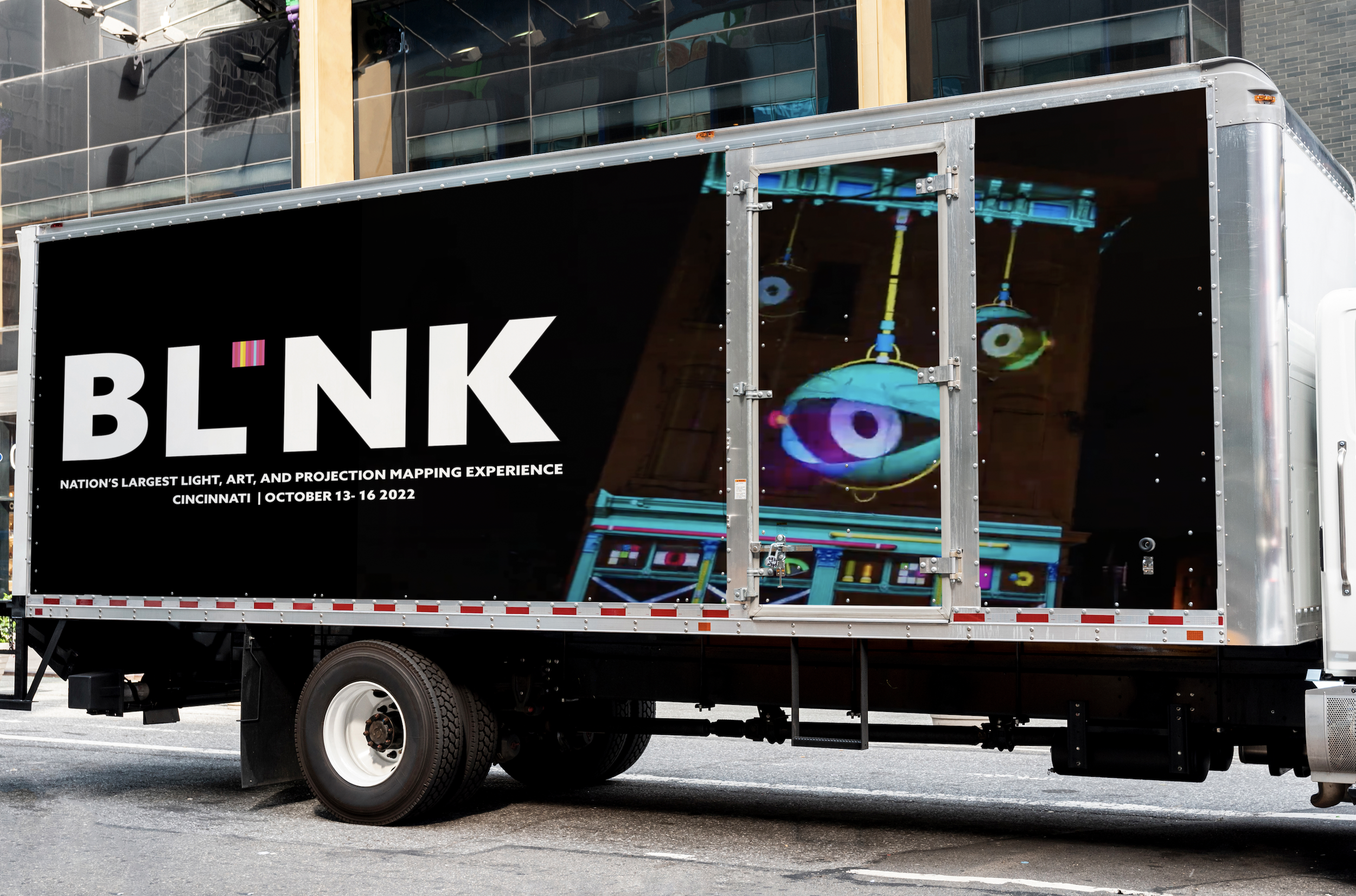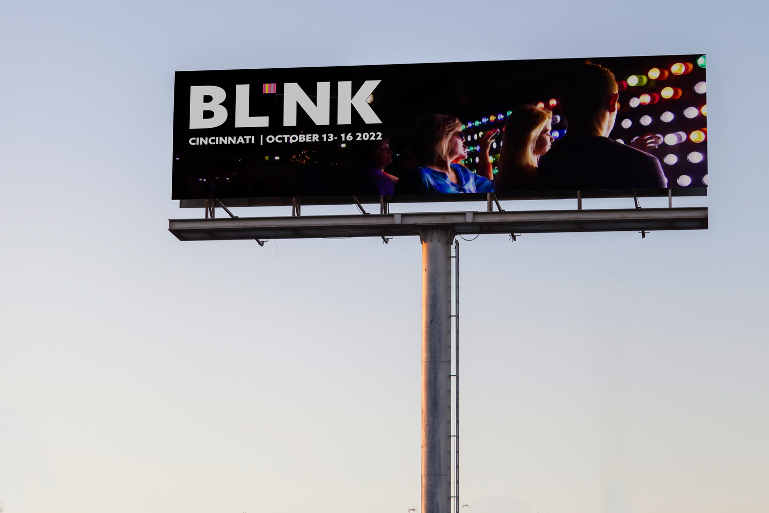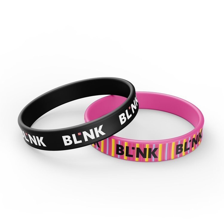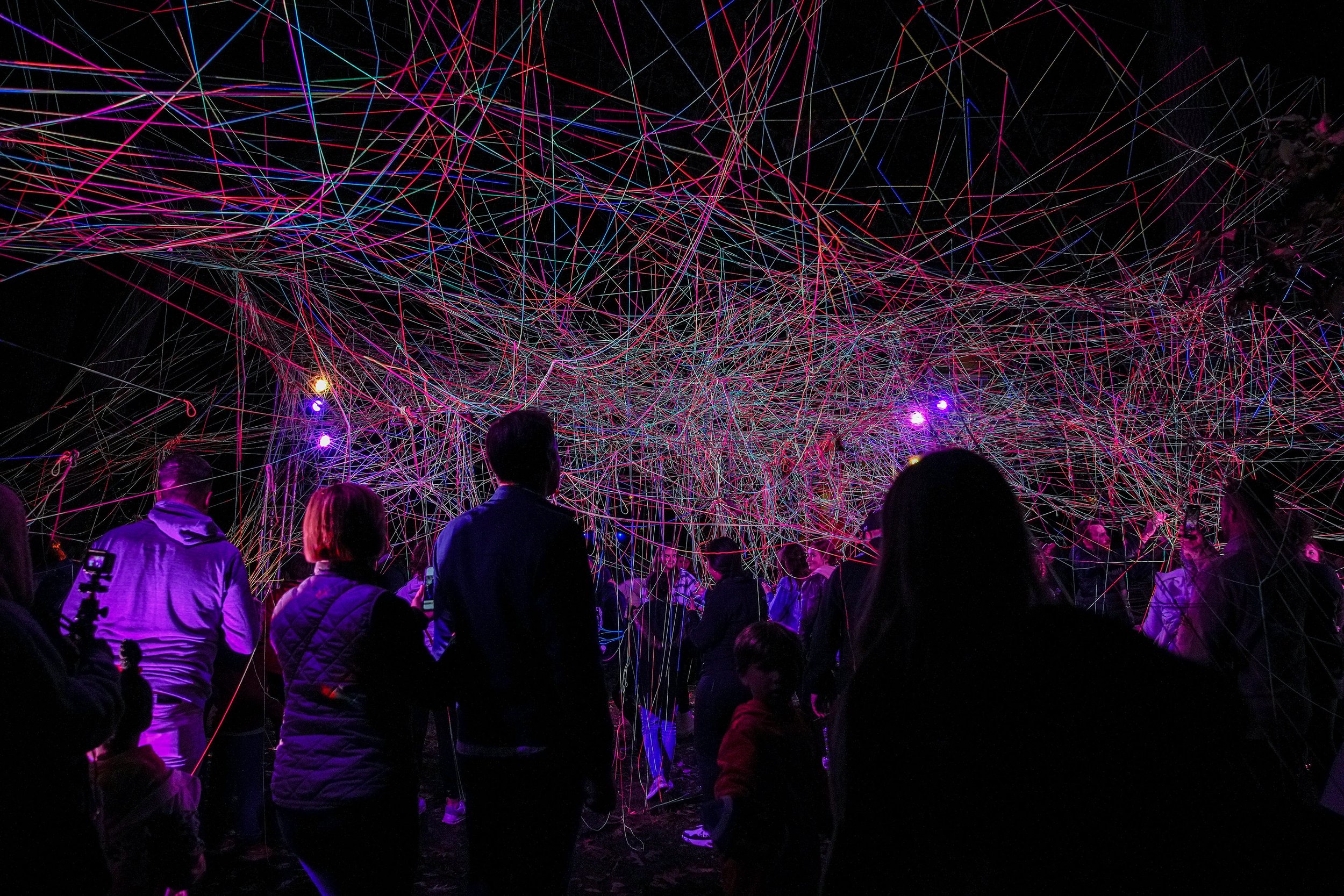
Mastered a branding process including the steps of conducted research, clarified strategy, design identity, created touch points, and managed assets to efficiently redesign the brand identity of my chosen event, Blink. Located in Cincinnati, Blink, is the nation’s largest light, art and projection mapping experience with recorded breaking-attendance in 2022 by over 2 million people.
Blink’s target market is the life of the greater Cincinnati region, a place where its residents are united and enlightened with a shared community experience in a festival of light and art, where exclusion has no place. I plan to address Text/Image Hierarchy, Contrast, Color Palette Iconography, and Alignment found in the current identity system. By addressing these areas, I hope to be able to express a clearer brand presence, reflect the event more effectively, and create a more enticing logo. A new identity system will be created and presented in a range of applications. The versatility of these applications in format and scale will showcase the new identity system’s success. The application that will be created are improving Instagram posts, Instagram stories, website design with logo, and merchandise.
BLINK: BRANDING REDESIGN


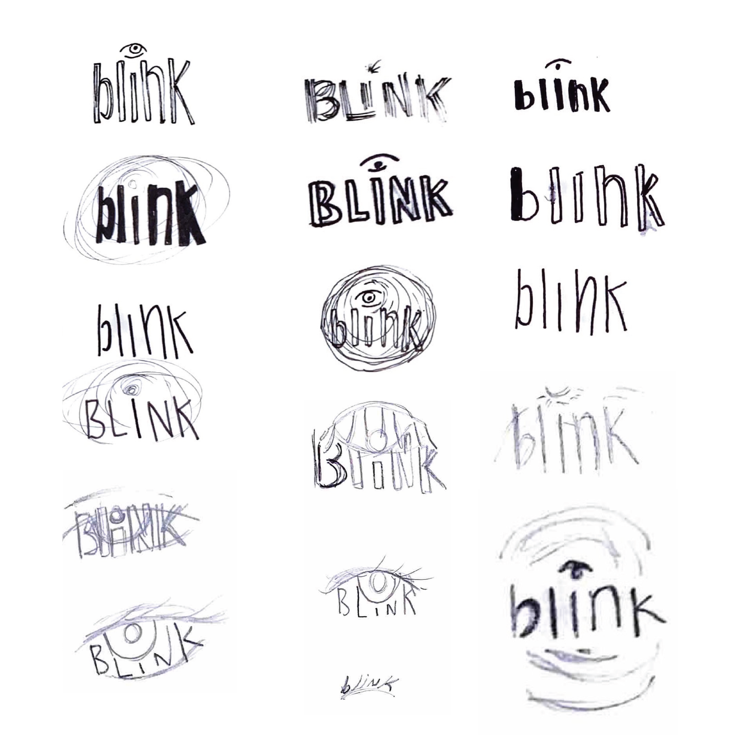
HAND SKETCHES:


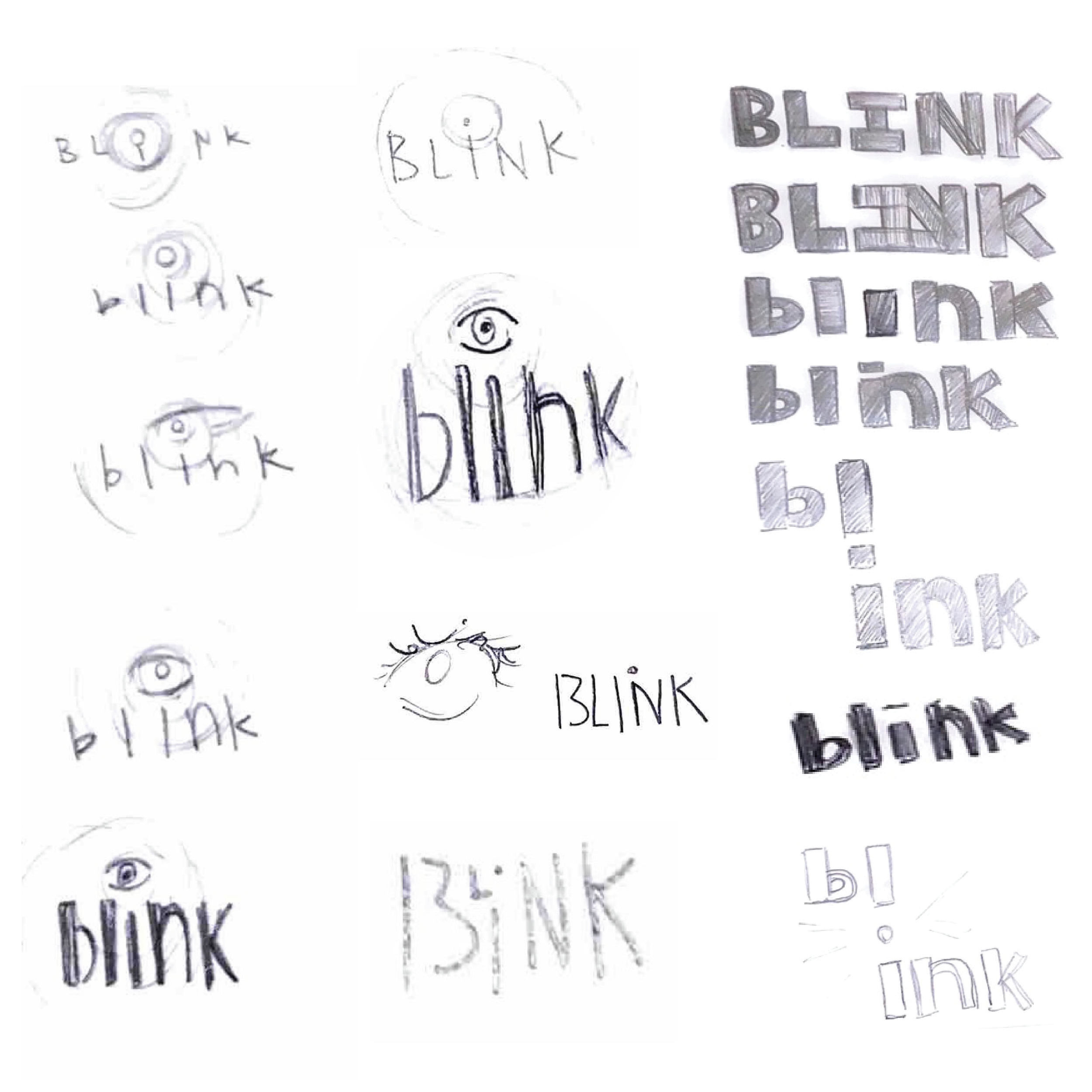
DIGITAL ITERATIONS:


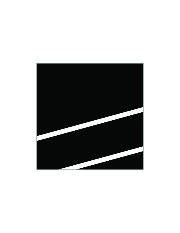
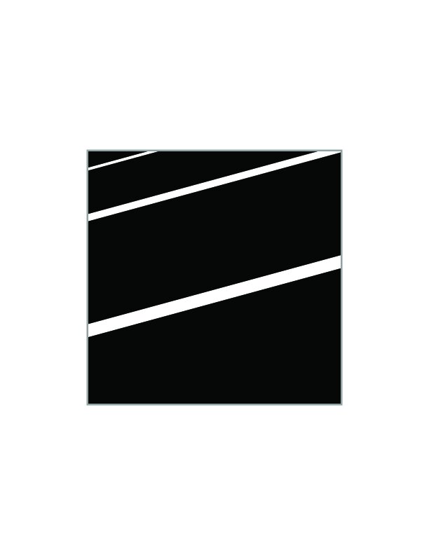
Creating movement with lines for concept 2 in the dot of the “i” with just black and white.
FORM STRUCTURE STUDIES:


Three unique concepts reflecting the event in different type ideations.
REFINED CONCEPTS:

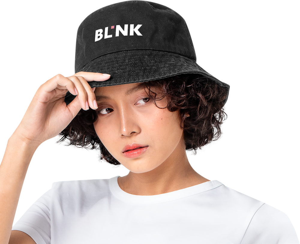
This logo encapsulates the vivid event in a simplified and effective way through type manipulation and pop of color.
FINAL LOGO (B&W AND COLOR):


ENVIRONMENTAL GRAPHIC STUDIES:


APPLICATIONS: