Recreating a new design system based on user feedback and needs for Craigslist.com to be more user friendly with navigation. Conducting usability testing, addressing user pain points, creating wireframes, developing information architecture, and establishing a visual system to effectively design a welcoming, cleaner, and simpler user accessible website.
CRAIGSLIST.COM: WEBSITE REDESIGN
USER TASKS:
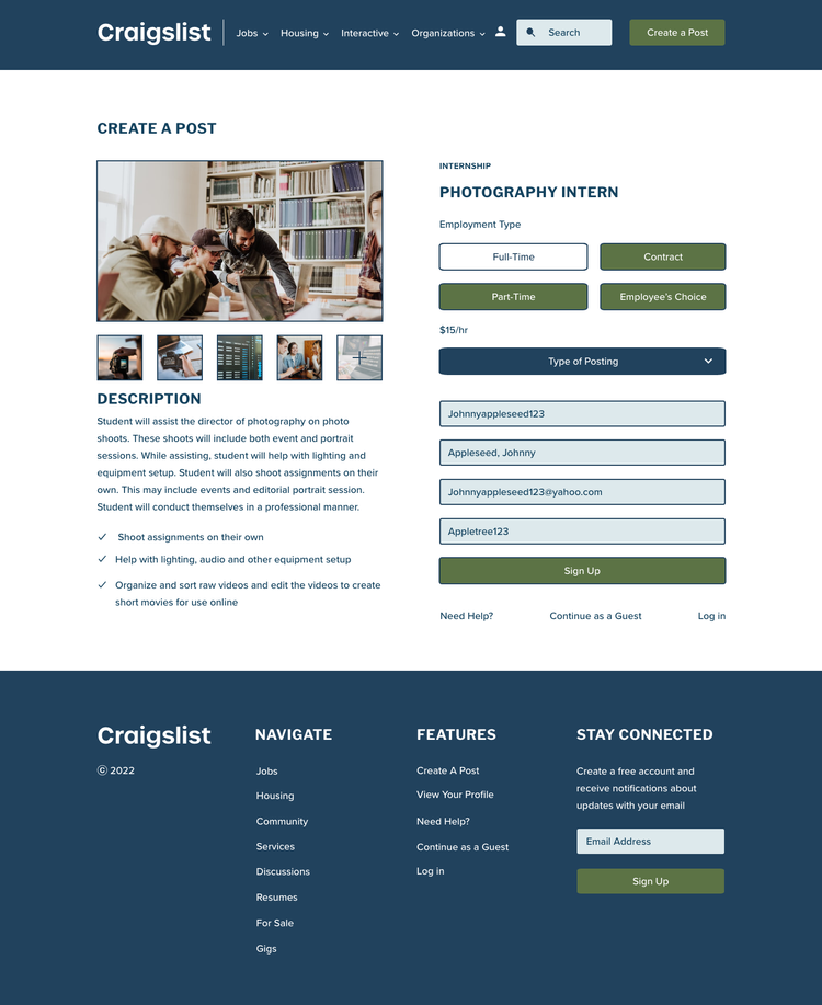
Task 1: Create a Post
Task 2: Find a Job in Art/ Media/ Design Category
Both processes allow the user to either choose Route A, B, or C that apply to certain task to finalize with a confirmation screen. Each route has four easy steps straight to the point, so the user can do the least amount of work as possible.
PROJECT GOALS:
To effectively redesign Craigslist.com for easier navigation and less user work for an end goal or task. Increase user accessibility by addressing color blindness and deficiency. Also, to fix pain points found through usability tasks for a more welcoming and simpler website for a user to operate.
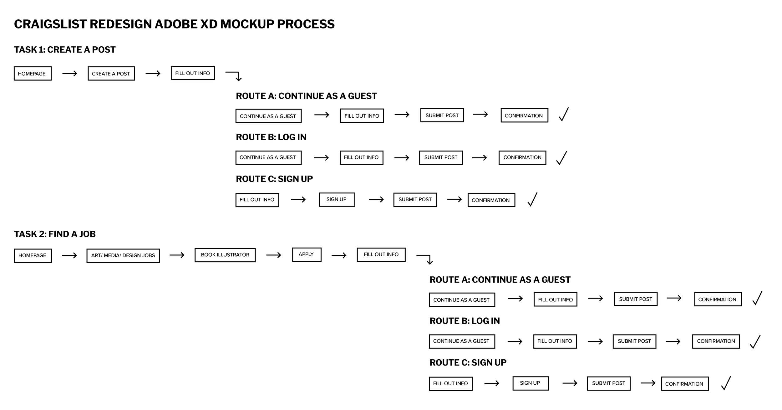
USER TESTING- TASK FLOW DIAGRAMS:


USABILITY STUDIES AND KEY INSIGHTS:
Conducted the two different task testings on a 25 year old, male graduate student in the medical practice (user 1) and a 20 year old, female college student in the field of design (user 2).
To prepare the users, I read them a set of instructions laying out an overview of each test and then ask them to complete each task with step by step instruction.
User 1 and User 2 asked me questions that I just reciprocated back allowing the test to be accurate. Both users spoke out loud during the process, mentally or physically kept trying to go back a screen or action.

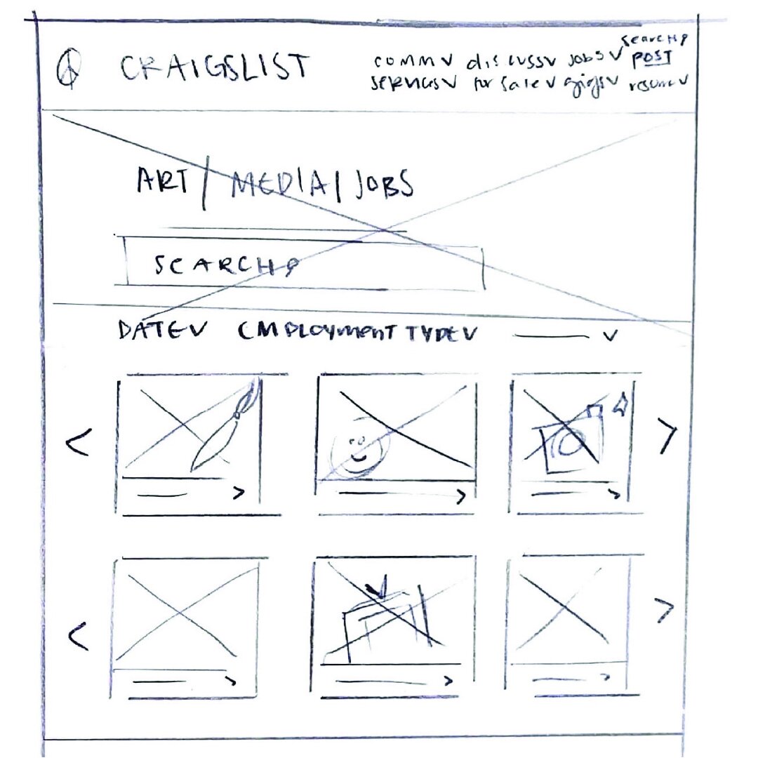
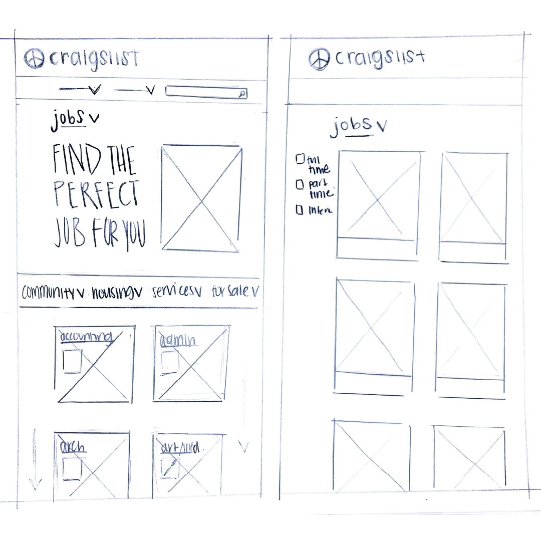
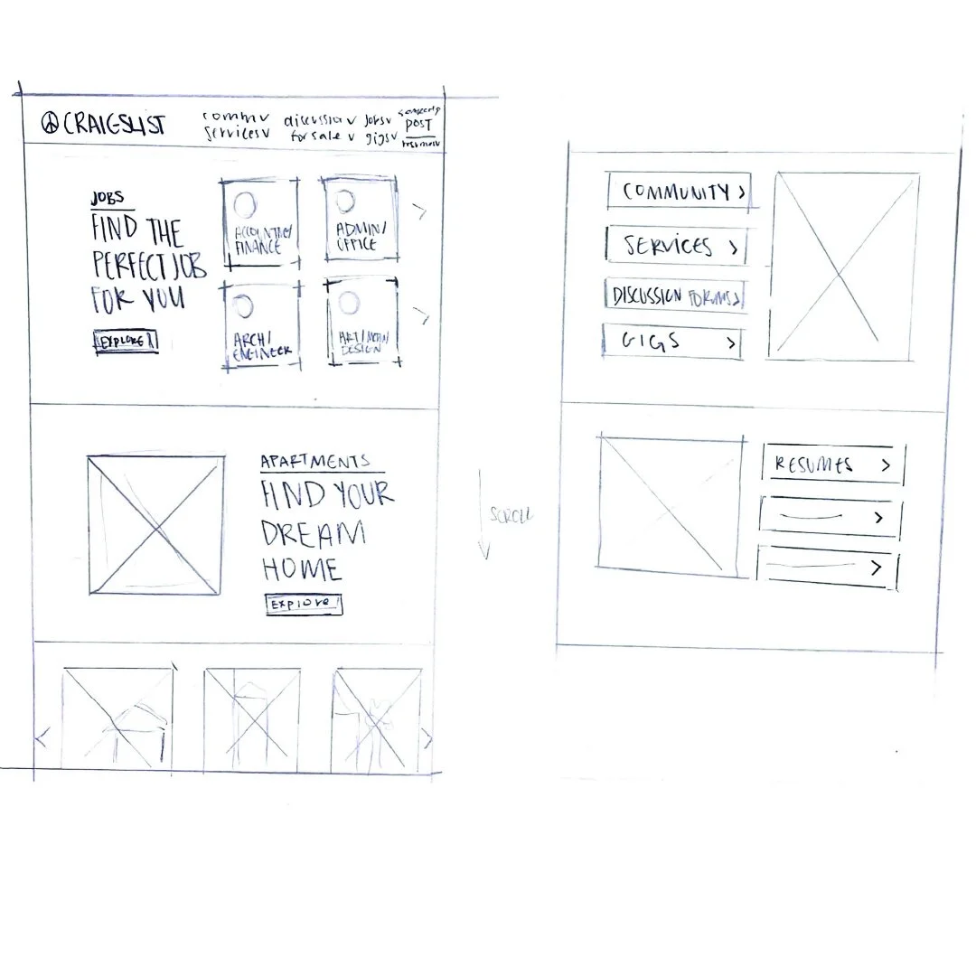
LAYOUT HAND SKETCHES:


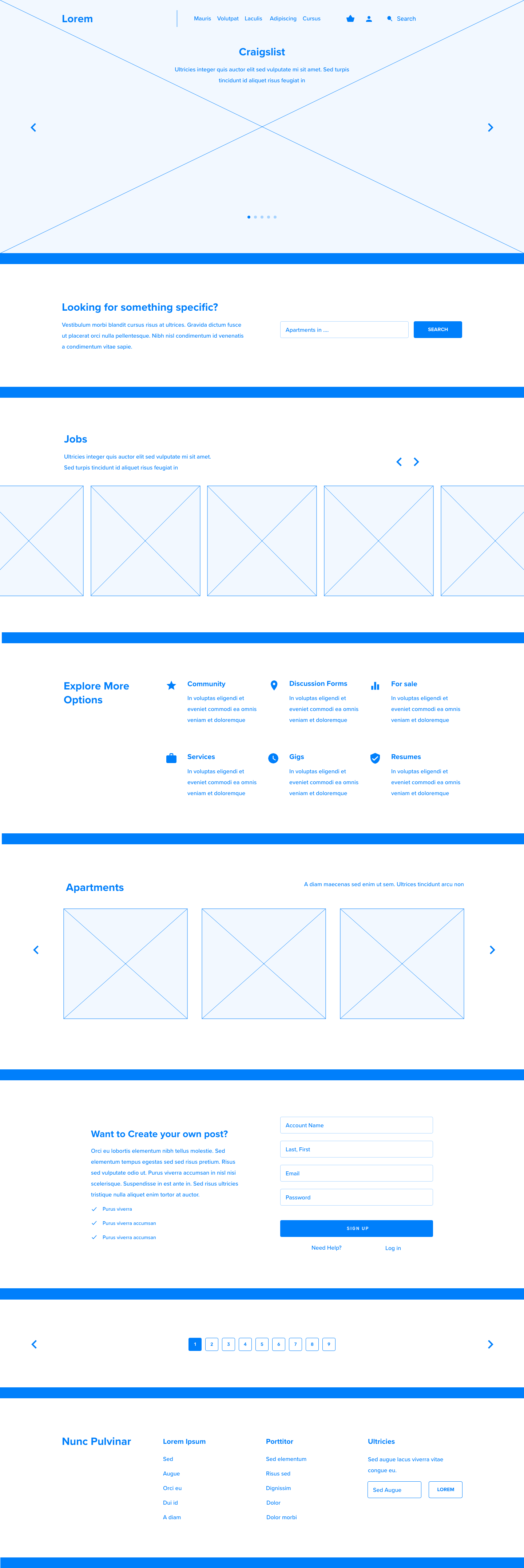
LOW-FI WIREFRAMES:


ATTRIBUTE HIGHLIGHTS:
TEXT HIERACHY:
Focusing on having complimenting H1, H2, H3, Eyebrow, and body to clearly organize and effectively work together to achieve text hierarchy. Craigslist.com is very overwhelming to a user due to the amount of type on a single page without organization.
ORGANIZATION:
Utilizing drop down menus in the header and laying out all the info throughout the homepage as well as the footer. Alternating background colors for sectioning and grouping purpose. Also, using iconography as well as images for grouping and hierarchy instead of typography.

COLOR PALETTE:
As a color blue personifies the attributes of calm, trust, and intelligence. Green represents growth, harmony, wealth, and stability. Both colors are the most effective combination for the most common type of color deficiency, red-green color blindness. 8% of males and .5% of women in the world are affected by this specific deficiency.
This color palette was specifically created for user accessibility as well as simplicity, unity, and welcoming feeling of three colors.

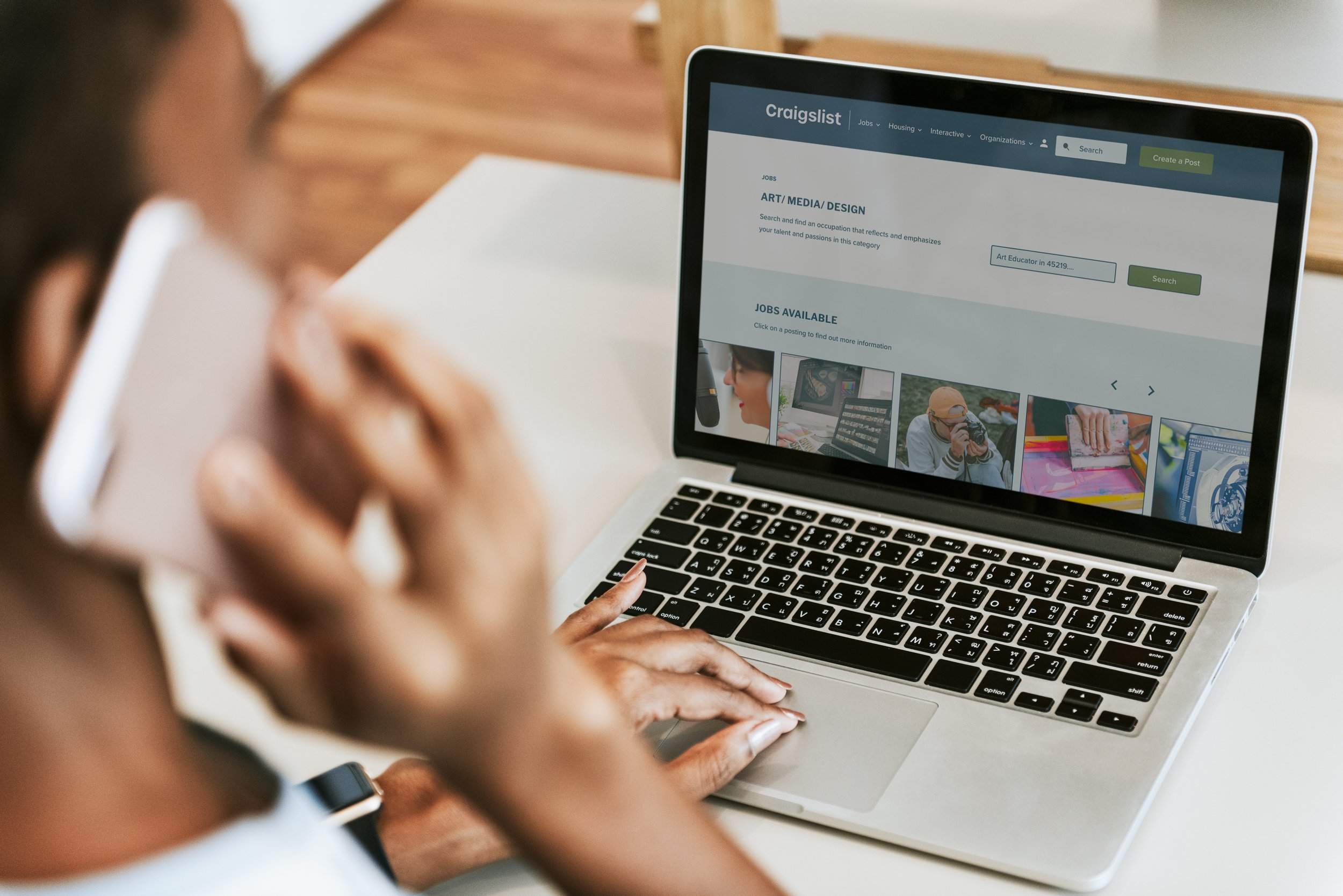
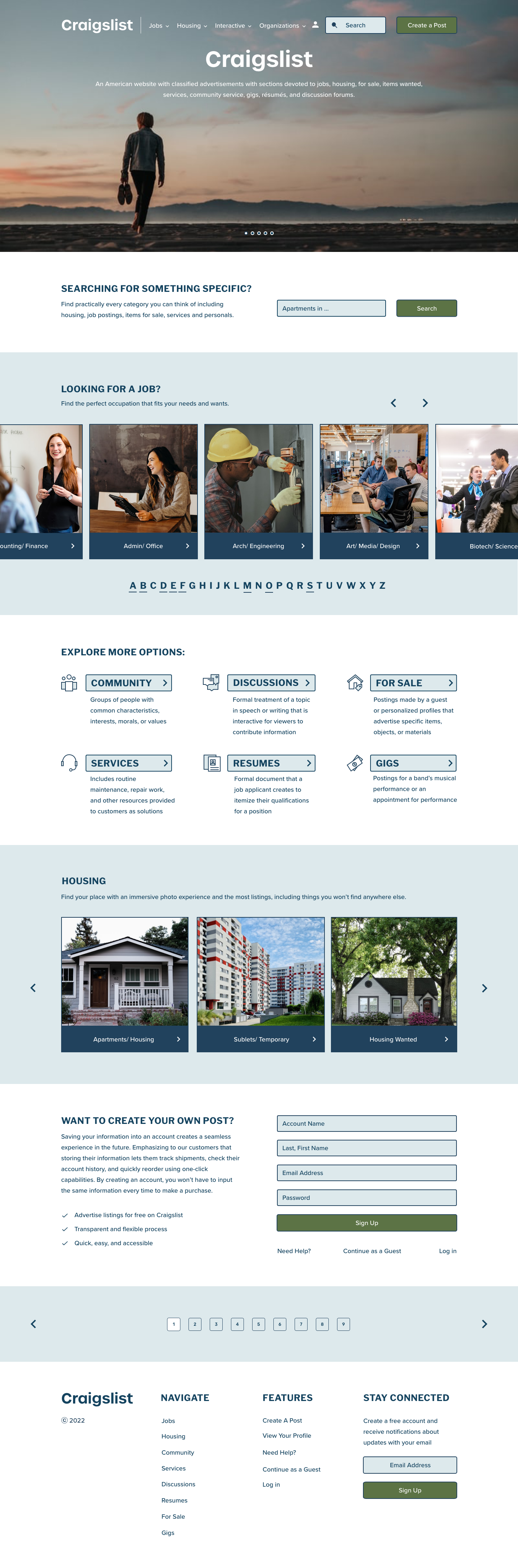
HIGH-FI WIREFRAMES:


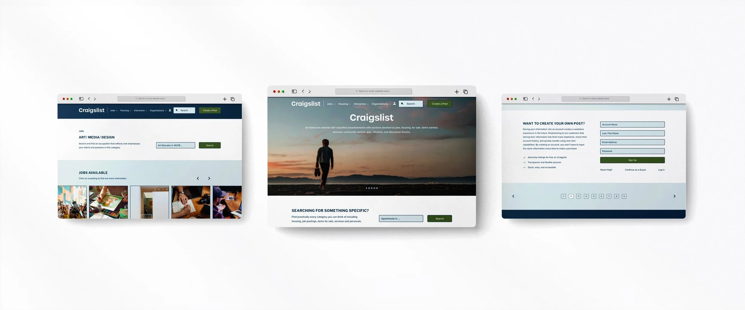
PROTOTYPING MOCKUP: